For those who don’t know, every time a new blog post gets added to R-Bloggers, it gets a corresponding tweet by @Rbloggers, which gets seen by Rbloggers’ ~20k followers fairly fast. And every time my post gets published, I can’t help but check up on how many people gave that tweet some Twitter love, ie. “favorite”d or “retweet”ed it. It’s even more exciting than getting a Facebook “like” on a photo from Costa Rica!
Seeing all these tweets and how some tweets get much more attention than others has gotten me thinking. Are there some power users who post almost all the content, or do many blogs contribute equally? Which posts were the most shared? Which blog produces the highest quality posts consistently? Are there more posts during the weekdays then weekends? And of course the holy grail of bloggers - is there a day when it’s better to post to get more shares?
To answer these questions, I of course turned to R. I used the twitteR package to get information about the latest 3200 tweets made by Rbloggers, Hadley’s httr to scrape each blog post to get the post’s author, and ggplot2 to visualize some cool aspects of the data. Unfortunately Twitter does not allow us to fetch any tweets older than that (if you know of a workaround, please let me know), so the data here will be looking at tweets made from September 2013 until now (mid May 2015). That’s actually a nice start date because it’s exactly when I started grad school and when I first used R. So you can think of this analysis as “R-Bloggers’ tweets since Dean’s R life started” :)
I’m going to use some terminology very loosely and interchangeably throughout this post:
- “blog” == “author” == “contributor”
- “tweet” == “post”
- “successful” post == “highly shared” == “high score” == “high quality”
It’s clear that all those terms not necessarily the same thing (for example, virality does not necessarily mean high quality), but I’ll be using them all as the same.
There is also an accompanying interactive document to supplement this post. That document has a few interactive plots/tables for data that is better explored interactively rather than as an image, and it also contains all the source code that was used to make the analysis and all the figures here. The source code is also available on GitHub as the raw text version of the interactive document. In this post I will not be including too much lengthy code, especially not for the plots.
Before going any further, I’d like to say that this is not intended to be a comprehensive analysis and definitely has many weaknesses. It’s just for fun. I’m not even going to be making any statistical significance tests at any point or do any quantitative analysis. Maybe titling this as “Analyzing” is wrong and should instead be “Exploring”? This post looks exclusively at data directly related to @Rbloggers tweets; I am not looking at data from any other social media or how many times the post was shared via R-Bloggers website rather than through Twitter. I’m also not looking at how much discussion (replies) a tweet generates. I wanted to include data from the number of times the “Tweet” button was pressed directly on R-Bloggers, but it looks like most older posts have 0 (maybe the button is a recent addition to R-Bloggers), so it’ll introduce an unfair bias towards new posts. And of course the biggest criticism here is that you simply can’t judge a blog post by the number of times it’s shared on Twitter, but here we go.
Table of contents
- Data preparation (booooring)
- Exploration (funnnn!!)
Data preparation
This is the boring part - get the data from Twitter, fill in missing pieces of information, clean up… Feel free to skip to the more exciting part.
Get data from Twitter
As mentioned above, I could only grab the last 3200 tweets made by @Rbloggers, which equates to all tweets since Sept 2013. For each tweet I kept several pieces of information: tweet ID, tweet date, day of the week the tweet was made, number of times tweet was favorited, number of times tweet was retweeted, tweet text, and the last URL in the tweet text. The tweet text is essentially a blog post’s title that has been truncated. I keep the last URL that appears in every tweet because that URL always points to the article on R-Bloggers. I’m only storing the date but losing the actual time, which is another weakness. Also, the dates are according to UTC, and many Rbloggers followers are in America, so it might not be the most correct.
Anyway, after authenticating with Twitter, here’s the code to get this information using twitteR:
MAX_TWEETS <- 3200
tweets_raw <- userTimeline('Rbloggers', n = MAX_TWEETS,
                           includeRts = FALSE, excludeReplies = TRUE)

tweets <-
  ldply(tweets_raw, function(x) {
    data_frame(id = x$id,
               date = as.Date(x$created),
               day = weekdays(date),
               favorites = x$favoriteCount,
               retweets = x$retweetCount,
               title = x$text,
               url = x$urls %>% .[['url']] %>% tail(1)
    )
  })

rm(tweets_raw)  # being extremely memory conscious
Remember the full source code can be viewed here.
Scrape R-Bloggers to get author info
Since I had some questions about the post authors and a tweet doesn’t give that information, I resorted to scraping the R-Bloggers post linked in each tweet using httr to find the author. This part takes a bit of time to run. There were a few complications, mostly with authors whose name is their email and R-Bloggers attemps to hide it, but here is how I accomplished this step:
# Get the author of a single post given an R-Bloggers post URL
get_post_author_single <- function(url) {
  if (is.null(url)) {
    return(NA)
  }

  # get author HTML node
  author_node <-
    GET(url) %>%
    httr::content("parsed") %>%
    getNodeSet("//a[@rel='author']")
  if (author_node %>% length != 1) {
    return(NA)
  }

  # get author name
  author <- author_node %>% .[[1]] %>% xmlValue

  # r-bloggers hides email address names so grab the email a different way
  if (nchar(author) > 100 && grepl("document\\.getElementsByTagName", author)) {
    author <- author_node %>% .[[1]] %>% xmlGetAttr("title")
  }

  author
}

# Get a list of URL --> author for a list of R-Bloggers post URLs
get_post_author <- function(urls) {
  lapply(urls, get_post_author_single) %>% unlist
}

# Add the author to each tweet.
# This will take several minutes because we're scraping r-bloggers 3200 times (don't run this frequently - we don't want to overwork our beloved R-Bloggers server)
tweets %<>% mutate(author = get_post_author(url))

# Remove NA author (these are mostly jobs postings, plus a few blog posts that have been deleted)
tweets %<>% na.omit
The last line there removed any tweets without an author. That essentially removes all tweets that are advertising job postings and a few blog posts that have been deleted.
Clean up data
It’s time for some clean up:
- Remove the URL and
#rstatshashtag from every tweet’s title - Older posts all contain the text “This article was originally posted on … and kindly contributed by …” - try to remove that as well
- Order the day factor levels in order from Monday - Sunday
- Truncate very long author names with an ellipsis
- Merge duplicate tweets (tweets with the same author and title that are posted within a week)
After removing duplicates and previously removing tweets about job postings, we are left with 2979 tweets (down from 3200). You can see what the data looks like here or see the code for the cleanup on that page as well.
Add a score metric
Now that we have almost all the info we need for the tweets, there is one thing missing. It’d be useful to have a metric for how successful a tweet is using the very little bit of information we have. This is of course very arbitrary. I chose to score a tweet’s success as a linear combination of its “# of favorites” and “# of retweets”. Since there are roughly twice as many favorites as retweets in total, retweets get twice the weight. Very simple formula :)
sum(tweets$favorites) / sum(tweets$retweets)   # result = 2.1
tweets$score <- tweets$favorites + tweets$retweets * 2
Exploration
Time for the fun stuff! I’m only going to make a few plots, you can get the data from GitHub if you want to play around with it in more depth.
Scores of all tweets
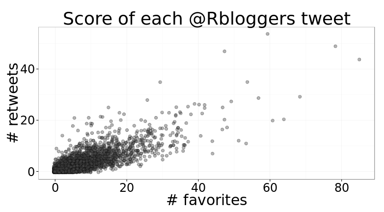
First I’d like to see a simple scatterplot showing the number of favorites and retweets for each blog post.
Looks like most posts are close to the (0, 0) area, with 20 favorites and 10 retweets being the maximum boundary for most. A very small fraction of tweets make it past the 40 favorites or 20 retweets.
Most successful posts
From the previous plot it seems like there are about 10 posts that are much higher up than everyone else, so let’s see what the top 10 most shared Rbloggers posts on Twitter were since Sep 2013.
| title | date | author | favorites | retweets | score |
|---|---|---|---|---|---|
| A new interactive interface for learning R online, for free | 2015.04.14 | DataCamp | 78 | 49 | 176 |
| Introducing Radiant: A shiny interface for R | 2015.05.04 | R(adiant) news | 85 | 44 | 173 |
| Choosing R or Python for data analysis? An infographic | 2015.05.12 | DataCamp | 59 | 54 | 167 |
| Why the Ban on P-Values? And What Now? | 2015.03.07 | Nicole Radziwill | 47 | 47 | 141 |
| Machine Learning in R for beginners | 2015.03.26 | DataCamp | 68 | 29 | 126 |
| Free Stanford online course on Statistical Learning (with R) starting on 19 Jan 2015 | 2014.11.22 | Yanchang Zhao | 54 | 35 | 124 |
| Four Beautiful Python, R, MATLAB, and Mathematica plots with LaTeX | 2014.12.20 | Plotly | 57 | 29 | 115 |
| In-depth introduction to machine learning in 15 hours of expert videos | 2014.09.24 | Kevin Markham | 64 | 20 | 104 |
| Learn Statistics and R online from Harvard | 2015.01.17 | David Smith | 49 | 27 | 103 |
| R Tutorial on Reading and Importing Excel Files into R | 2015.04.04 | DataCamp | 61 | 20 | 101 |
8/10 of the top 10 posts have “R” in their title… correlation or causation or random? Maybe I should start doing that too then!
Looks like the DataCamp blog is a pretty major Rbloggers contributor with 4/10 of the most tweeted posts. Which leads me perfectly into the next section.
Highest scoring authors
So as I just said, DataCamp looks like it contributes very high quality posts. I wanted to see which blogs contribute the most successful posts consistently. The following shows the authors with the highest average score per tweet.
| author | num_tweets | avg_favorites | avg_retweets | avg_score |
|---|---|---|---|---|
| R(adiant) news | 1 | 85.0 | 44.0 | 173.0 |
| Martin Schneider | 1 | 34.0 | 25.0 | 84.0 |
| Juuso Parkkinen | 1 | 34.0 | 22.0 | 78.0 |
| Tal Yarkoni | 1 | 15.0 | 25.0 | 65.0 |
| Kevin Markham | 6 | 35.8 | 13.0 | 61.8 |
| Dean Attali’s R Blog | 5 | 32.2 | 13.2 | 58.6 |
| filip Schouwenaars | 1 | 26.0 | 16.0 | 58.0 |
| Christian Groll | 1 | 13.0 | 21.0 | 55.0 |
| Josh Paulson | 1 | 23.0 | 15.0 | 53.0 |
| Kushan Shah | 1 | 33.0 | 10.0 | 53.0 |
First impression: Woo, I’m in there! :D
Posts by highest scoring authors
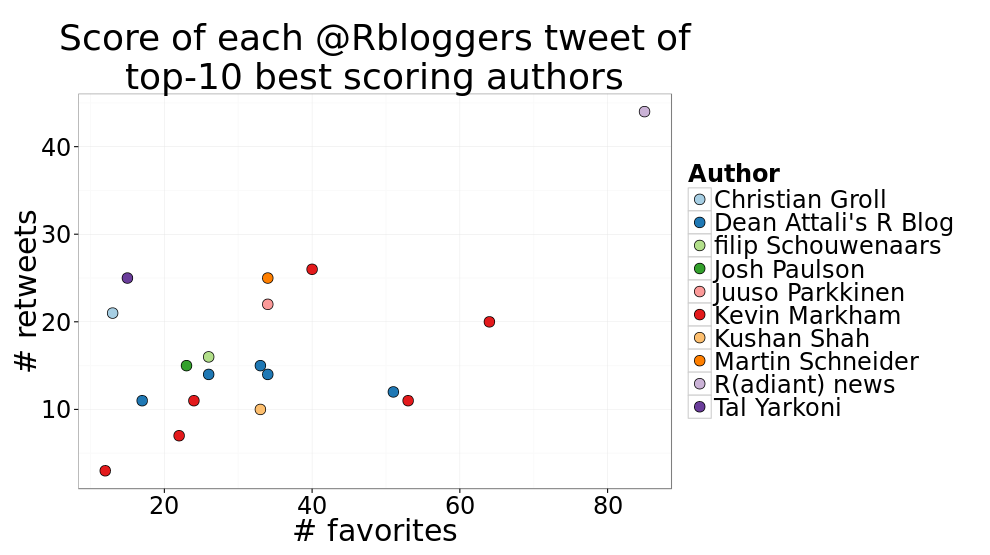
Now that I know which blogs have the best posts on average, I wanted to see what each of their tweets looked like.
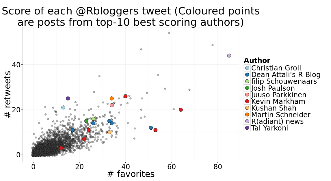
It’ll be nice to see how these compare to all other posts. The following figure shows the scores of all tweets, and highlights the posts made by any of the top-10 authors.
Pretty. But it looks like the list of top 10 authors is dominated by one-hit wonders, which makes sense because it’s much easier to put a lot of effort into one single post than to constantly pump out great articles over and over again. So let’s try again seeing who has the highest average score, but only consider blogs that contributed more than one post.
| author | num_tweets | avg_favorites | avg_retweets | avg_score |
|---|---|---|---|---|
| Kevin Markham | 6 | 35.8 | 13.0 | 61.8 |
| Dean Attali’s R Blog | 5 | 32.2 | 13.2 | 58.6 |
| Matt | 2 | 27.5 | 12.0 | 51.5 |
| Bruno Rodrigues | 4 | 23.8 | 13.2 | 50.2 |
| Plotly | 7 | 25.6 | 11.6 | 48.7 |
| DataCamp | 32 | 23.3 | 12.4 | 48.0 |
| Tim Phan | 2 | 27.5 | 9.0 | 45.5 |
| Slawa Rokicki | 3 | 21.0 | 11.3 | 43.7 |
| Jan Górecki - R | 3 | 25.3 | 8.7 | 42.7 |
| Nicole Radziwill | 13 | 21.3 | 10.3 | 41.9 |
Ah, there’s DataCamp - by far more posts than the rest of us, and still a very high average score. Respect.
Who contributes the most?
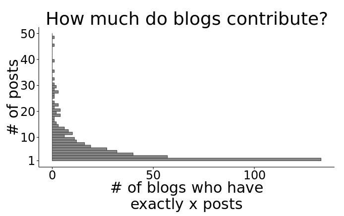
I also wanted to know how many blogs contribute and how much each one contributes. R-Bloggers says on its frontpage that there are 573 blogs. According to my data, there are 420 unique authors since Sept 2013, so about 1/4 of the blogs have not posted since then. Here is the distribution of how many blog posts different blogs made:
Seems like a lot of people only posted once in the past 1.5 years. That graph is actually cut off at 50 because there are a few outliers (individuals who posted way more than 50). Let’s see who these power users are, so we know who to thank for most of the content.
| author | num_tweets | avg_favorites | avg_retweets | avg_score |
|---|---|---|---|---|
| David Smith | 166 | 7.9 | 5.6 | 19.2 |
| Thinking inside the box | 118 | 1.8 | 0.9 | 3.6 |
| Joseph Rickert | 117 | 8.3 | 3.8 | 15.9 |
| xi’an | 88 | 3.1 | 1.2 | 5.6 |
| Tal Galili | 71 | 5.7 | 4.2 | 14.1 |
There you have it - the 5 people who single-handedly (or.. quintuple-handedly?) are responsible for 1/6 of the posts we’ve seen since I learned what R is.
Post success by day of week
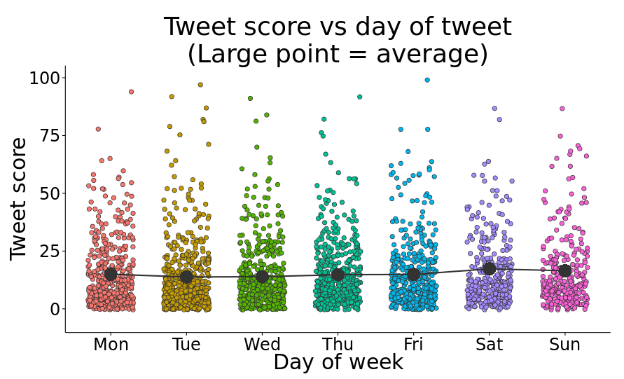
One of my main questions was whether there is some correlation between when a post is posted and how successful it is. I also wanted to see if there are certain days of the week that are more/less active. Here is a table summarizing the number of posts made on each day of the week and how successful each day was on average.
| day | num_tweets | favorites_per_post | retweets_per_post | avg_score |
|---|---|---|---|---|
| Monday | 451 | 7.6 | 3.7 | 15.0 |
| Tuesday | 551 | 7.2 | 3.3 | 13.8 |
| Wednesday | 461 | 7.1 | 3.4 | 13.9 |
| Thursday | 487 | 7.6 | 3.6 | 14.8 |
| Friday | 429 | 7.5 | 3.7 | 14.9 |
| Saturday | 323 | 8.7 | 4.3 | 17.3 |
| Sunday | 277 | 8.9 | 3.8 | 16.5 |
Cool! This actually produced some non-boring results. I’m not going to make any significance tests, but I do see two interesting pieces of information here. First of all, it looks like the weekend (Sat-Sun) is quieter than weekdays in terms on number of posts made. Second of all, the two days with the highest average score are also Sat-Sun. I won’t go into whether or not having ~1 more favorite and < 1 more retweet on average is significant, but it’s at least something. Maybe because there are less posts on the weekend, each post gets a bit more visibility and stays at the top of the feed longer, thereby having a small advantage? Or maybe the small difference in score we’re seeing is just because there are less posts in total and it’ll even out once n is large enough?
Whatever the case might be, here’s a plot that shows the score of every tweet grouped by day. The large points show the average of all posts made on that day.
Significant or not, at least it looks pretty.
Wordcloud
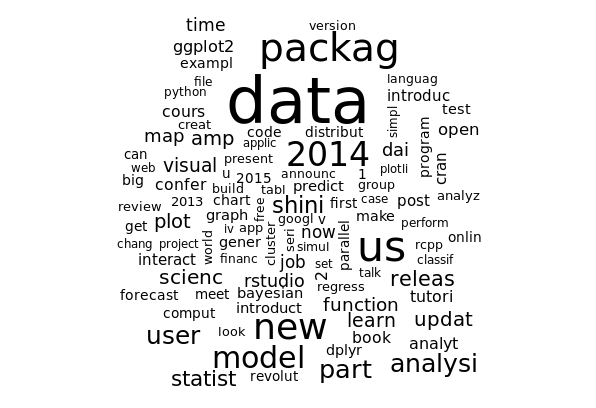
I must admit I’m not the biggest fan of wordclouds, but it feels like no amateur R analysis can be complete without one of these bad boys these days. Here you go wordcloud-lovers - the 100 most popular terms in R-Bloggers posts’ titles since Sept 2013.
I actually don’t have much to comment on that, there isn’t anything that strikes me as surprising here.
Remember to check out the accompanying interactive doc + source code!
