My first CRAN package, ggExtra, contains several functions to enhance ggplot2, with the most important one being ggExtra::ggMarginal() - a function that finally allows easily adding marginal density plots or histograms to scatterplots.
Availability
You can read the full README describing the functionality in detail or browse the source code on GitHub.
The package is available through both CRAN (install.packages("ggExtra")) and GitHub (devtools::install_github("daattali/ggExtra")).
Spoiler alert - final result
You can see a demo of what ggMarginal can do and play around with it in this Shiny app.
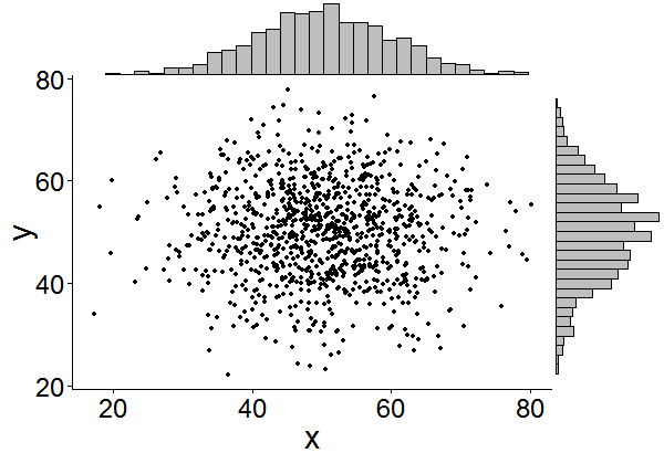
Here is an example of how easy it is to add marginal histograms in ggplot2 using ggExtra::ggMarginal().
library(ggplot2)
# create dataset with 1000 normally distributed points
df <- data.frame(x = rnorm(1000, 50, 10), y = rnorm(1000, 50, 10))
# create a ggplot2 scatterplot
p <- ggplot(df, aes(x, y)) + geom_point() + theme_classic()
# add marginal histograms
ggExtra::ggMarginal(p, type = "histogram")
Marginal plots in ggplot2 - The problem
Adding marginal histograms or density plots to ggplot2 seems to be a common issue. Any Google search will likely find several StackOverflow and R-Bloggers posts about the topic, with some of them providing solutions using base graphics or lattice. While there are some great answers about how to solve this for ggplot2, they are usually very specific to the dataset in question and do not provide code that is easily reusable.
A simple drop-in function for adding marginal plots to ggplot2 did not exist, so I created one.
Marginal plots in ggplot2 - Basic idea
The main idea is to create the marginal plots (histogram or density) and then use the gridExtra package to arrange the scatterplot and the marginal plots in a “2x2 grid” to achieve the desired visual output. An empty plot needs to be created as well to fill in one of the four grid corners. This basic approach can be implemented like this:
library(ggplot2)
library(gridExtra)
pMain <- ggplot(mtcars, aes(x = wt, y = mpg)) +
         geom_point()
pTop <- ggplot(mtcars, aes(x = wt)) +
        geom_histogram()
pRight <- ggplot(mtcars, aes(x = mpg)) +
        geom_histogram() + coord_flip()
pEmpty <- ggplot(mtcars, aes(x = wt, y = mpg)) +
          geom_blank() +
          theme(axis.text = element_blank(),
                axis.title = element_blank(),
                line = element_blank(),
                panel.background = element_blank())

grid.arrange(pTop, pEmpty, pMain, pRight,
             ncol = 2, nrow = 2, widths = c(3, 1), heights = c(1, 3))
This works, but it’s a bit tedious to write, so at first I just wanted a simple function to abstract all this ugly code away. This was the birth of ggMarginal, which was later developed into the ggExtra package, together with a few other functions.
The abstraction was done in a way that allows the user to either provide a ggplot2 scatterplot, or the dataset and variables. For example, the following two calls are equivalent:
ggExtra::ggMarginal(data = mtcars, x = "wt", y = "mpg")
ggExtra::ggMarginal(ggplot(mtcars, aes(wt, mpg)) + geom_point())
Marginal plots in ggplot2 - Next steps
As you can see, that basic plot works, but it is not very nice looking and can have some work done on it. A few things come to mind quickly:
- Remove the whitespace between the scatterplot and the marginal plots
- Remove the marginal plots background
- Remove the axis labels from the marginal plots
These are all very easy to add with various ggplot2::theme() parameters, and adding these to a ggMarginal function will already provide a nice useful function for adding marginal plots to ggplot2.
There are some more issues that could be addressed in order to make the function even more robust.
- The marginal plot doesn’t necessary have the same axes as the scatterplot - notice how the
mpgaxis range in the previous plot don’t match up between the scatterplot and the marginal histogram. - If the main plot has a title, then the right marginal plot will go “too high”.
- If the axis labels text is enlarged, then a similar issue happens - the marginal plots position will be out of sync with the main scatterplot.
- If the axis label is multiline, then a similar issue happens again.
The following plot illustrates all these problems. It was achieved with exactly the same code as before, but adding these 3 lines to pMain definition:
theme_gray(35) +
ggtitle("Cars weight vs miles/gallon") +
xlab("car\nweight")
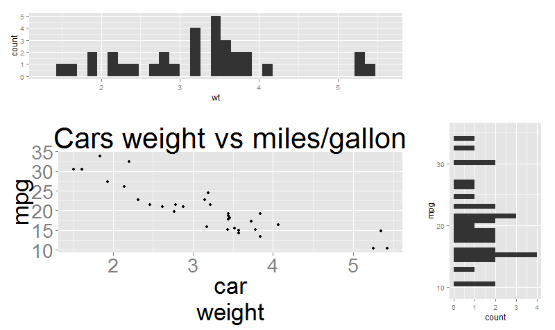
Accounting for these issues is a little trickier and requires a bit of “dirty” code. To address these problems, I used ggplot_build(), which is a handy function that can be used to retrieve information from a plot. Using ggplot_build, it’s possible to look at the internals of a plot object and identify the axis range, the text size, etc. It’s importante to note that since these parameters are not provided via a direct function call, it’s not considered 100% safe to use them because there is no guarantee that the plot internals will always look the same way. I won’t post the code here because it’s long but you can view the source code of my solution on GitHub.
Lastly, a function that adds marginal plots to a ggplot2 scatterplot could benefit from a few more features to make it more complete:
- Support drawing a marginal plot only along the x or y axis, not necessarily both.
- Support making the marginal plot either a density plot or a histogram.
- Allow the user to set the marginal plot’s colour and relative size.
All of these features and more are implemented in ggExtra::ggMarginal.
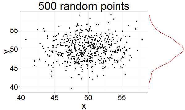
Here is an example of using a few more parameters:
library(ggplot2)
# create dataset with 500 normally distributed points
df <- data.frame(x = rnorm(500, 50, 3), y = rnorm(500, 50, 3))
# create a ggplot2 scatterplot
p <- ggplot(df, aes(x, y)) + geom_point() +
     theme_bw(30) + ggtitle("500 random points")
# add marginal density along the y axis
ggExtra::ggMarginal(p, type = "density", margins = "y", size = 4, marginCol = "red")
Other functions in the ggExtra package
ggExtra provides with a few extra convenience functions:
removeGrid- Remove grid lines from ggplot2. Minor grid lines are always removed, and the major x or y grid lines can be removed as well.rotateTextX- Rotate x axis labels. Often times it is useful to rotate the x axis labels to be vertical if there are too many labels and they overlap.plotCount- Plot count data with ggplot2. Quickly plot a bar plot of count (frequency) data that is stored in a table or data.frame.
Technical notes about using gridExtra
gridExtra is a very useful package with two functions for showing multiple ggplot2 plots: arrangeGrob and grid.arrange. However, using these functions inside a package has proven to be difficult because of the way gridExtra handles namespaces. A short discussion can be found on this StackOverflow post. While I do not completely undersand the underlying problem (I don’t fully understand package mports/depends/attaching/etc), I did find workarounds to the problems and would love feedback if anyone has any comments.
Problem 1: could not find function “ggplotGrob”
When trying to call gridExtra::grid.arrange() without loading ggplot2 you get this error:
f <- function() {
  p1 <- ggplot2::ggplot(mtcars, ggplot2::aes(wt, mpg)) + ggplot2::geom_blank()
  gridExtra::grid.arrange(p1)
}
f()
> Error: could not find function "ggplotGrob"
My workaround is to ensure ggplot2 is loaded:
f <- function() {
  if (!"package:ggplot2" %in% search()) {
    suppressPackageStartupMessages(attachNamespace("ggplot2"))
    on.exit(detach("package:ggplot2"))
  }
  p1 <- ggplot2::ggplot(mtcars, ggplot2::aes(wt, mpg)) + ggplot2::geom_blank()
  gridExtra::grid.arrange(p1)
}
f()
I know it’s hacky so I would appreciate better solutions.
Problem 2: No layers in plot
The problem with grid.arrange is that it returns NULL and does not allow the plot to be saved to an object. arrangeGrob is a similar function that returns the object. But substituting arrangeGrob for grid.arrange gives an error
f <- function() {
  if (!"package:ggplot2" %in% search()) {
    suppressPackageStartupMessages(attachNamespace("ggplot2"))
    on.exit(detach("package:ggplot2"))
  }
  p1 <- ggplot2::ggplot(mtcars, ggplot2::aes(wt, mpg)) + ggplot2::geom_blank()
  (gridExtra::arrangeGrob(p1))
}
f()
> Error: No layers in plot
This error happens only if gridExtra is not loaded, and it’s because printing the object is done after the function returns and uses a custom print method. So the solution is to add a class to the return object and add a print generic that ensures the object will print correctly.
f <- function() {
  if (!"package:ggplot2" %in% search()) {
    suppressPackageStartupMessages(attachNamespace("ggplot2"))
    on.exit(detach("package:ggplot2"))
  }
  p1 <- ggplot2::ggplot(mtcars, ggplot2::aes(wt, mpg)) + ggplot2::geom_blank()
  grob <- gridExtra::arrangeGrob(p1)
  class(grob) <- c("mygrob", class(grob))
  grob
}
print.mygrob <- function(x, ...) {
  grid::grid.draw(x)
}
f()
These were my solutions to the gridExtra problems that I implemented in ggExtra, but I would appreciate feedback on other approaches.